
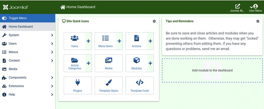
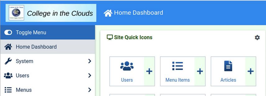
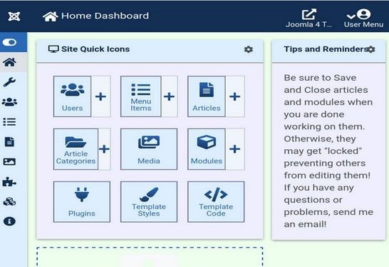
Joomla 4 offers numerous benefits over Joomla 3. In particular, I am very excited about using CSS Grid – which will make displaying web content easier than ever. One area of concern, reflected in the Joomla 4 Forum comments, is that many people view the new Joomla 4 Dashboard as being much more difficult to learn and use that the prior Joomla 3 Dashboard. Here is the Joomla 4 Dashboard:
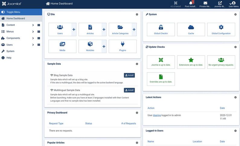
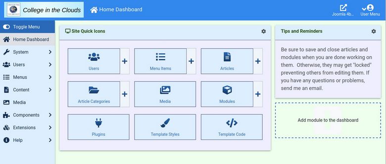
There are 9 modules displayed in the main area plus a Main Menu in the sidebar (with 30 links) and 5 more links in the top bar. The System menu item has 31 more links. Many you will never use. We will review how to simplify the Dashboard so that it will look like this:
But before we begin I want to stress that I am not proposing that any changes be made to the Joomla 4 Dashboard. Instead, the purpose of this article is to summarize a series of easy steps you can take if you are want to simplify the dashboard. Even if you like the new dashboard, following along with this tutorial can be a good introduction to the Joomla 4 dashboard and a great way to learn more about how it works. Here are five ways to simplify the dashboard:
#1 Hide a bunch of stuff that most users will rarely need.
Simplicity is an important issue. As a teacher, the simpler I can make Joomla, the more successful my students will be. We will review how to hide a bunch of stuff to make the Atum Dashboard less complex.
#2 Change the dashboard menu structure to make it more like the Joomla 3 menu structure.
The Joomla 3 menu structure was easier to understand than the new Joomla 4 menu structure. We will therefore review how to make the Atum menu structure more like the Joomla 3 Admin menu structure.
#3 Add more color to the Joomla 4 Dashboard.
As a teacher, I use colors to help students learn about various parts of a program. Some people just like looking at their favorite colors when staring at a computer monitor all day. We will show you several ways to add as many colors as you want to the Atum dashboard.
#4 Make the Joomla 4 Dashboard more compact.
Space is an important issue. Every pixel counts. As a teacher, I encourage my students to build their websites using side by side editing. This means first building your website with a text and images editing program like Libre Writer and then transferring it to Joomla using a browser screen which is open next to your Libre Writer screen. Assuming you are working on a 15 inch laptop with a width of 1980 pixels, and that your Writer screen takes up 900 pixels, this only leaves 1080 pixels for your web browser displaying the Atum dashboard. We will show you how to make Atum more compact.
#5 Replace the Joomla 4 Side Menu with the Joomla 3 Top Menu
All of these tasks can be accomplished in less time than it takes to read this article! Now that we understand the plan, let’s go through the actual steps.
#1 Hide a bunch of stuff that most users will rarely need.
Having less stuff on the dashboard allows you to focus your attention on what really matters. It also gives beginners more confidence that they can actually learn how to use Joomla. In Joomla 3, this process required going to the Module Manager and clicking on Administrator and then unpublishing several Admin modules. In Joomla 4, this process is even easier – because there is now a setting wheel icon in the upper right corner of each Admin module allowing you to either Edit the Module or unpublish it completely.
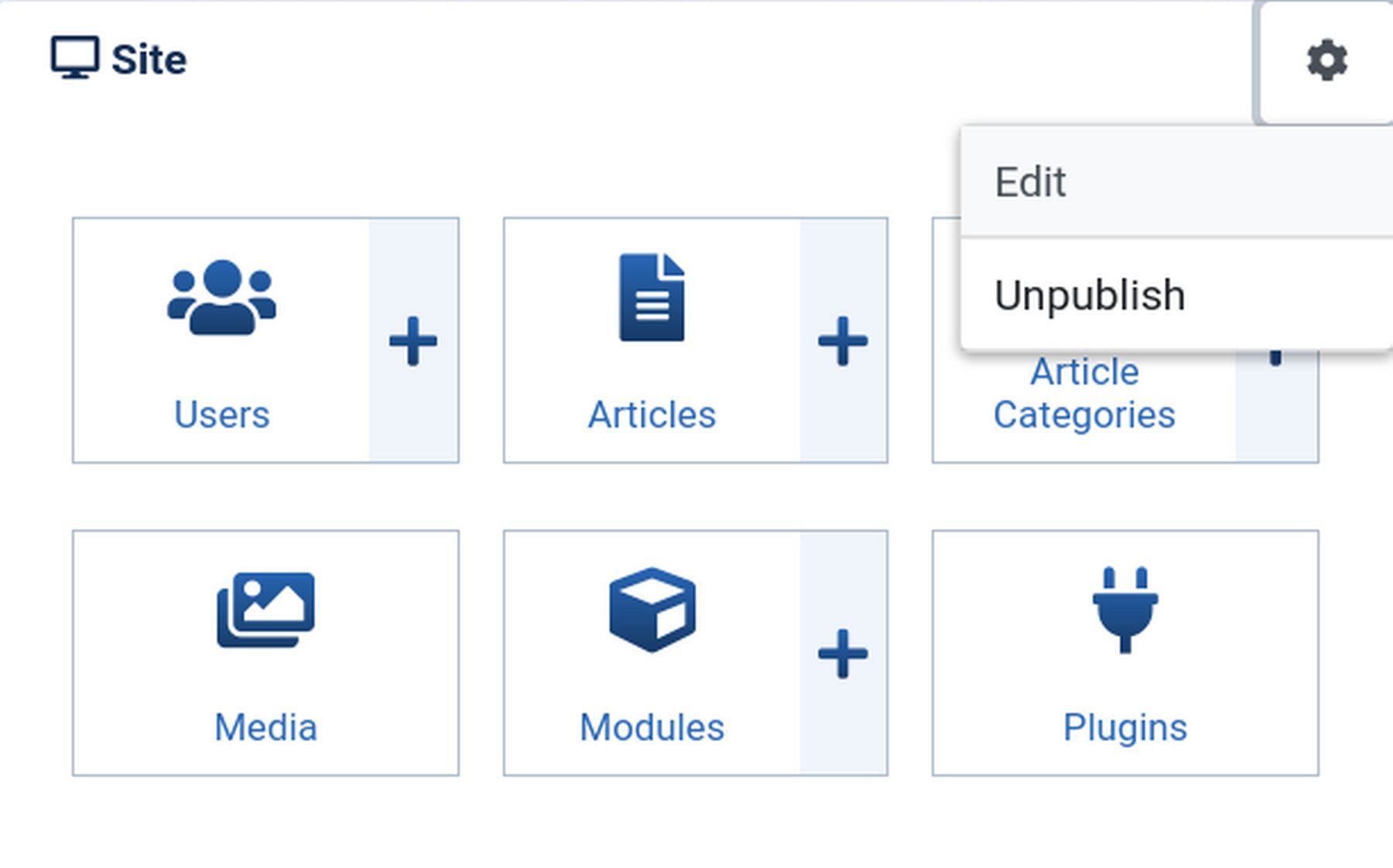
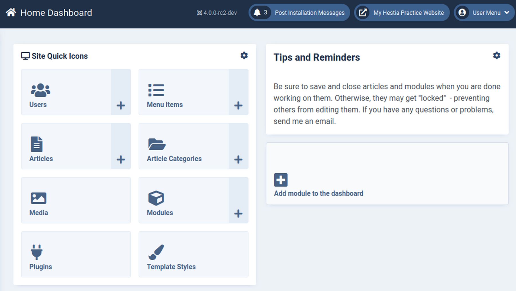
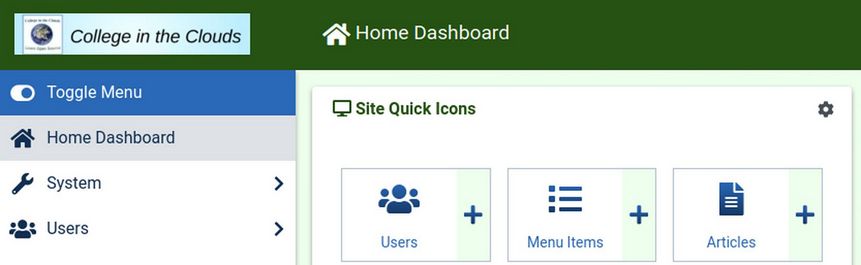
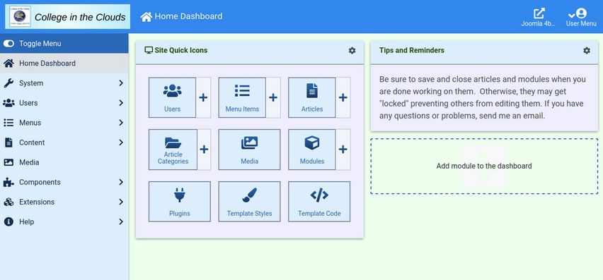
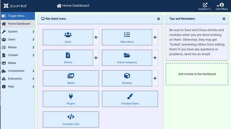
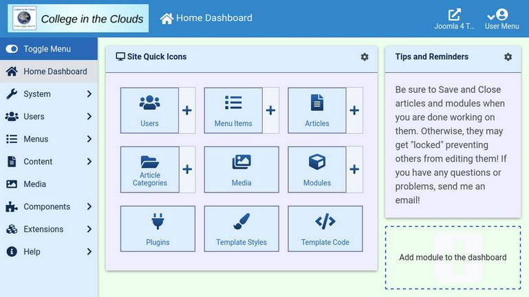
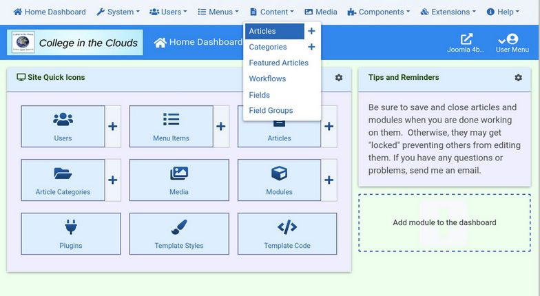
Unpublish all the Admin Modules on the Dashboard with the exception of the Site module. For the Site module, click on Edit and change the name to Site Quick Icons. Then scroll down the screen and add 2 more Quick Icons to the 6 already shown - resulting in the following 8 icons: User, Articles, Modules, Categories, Media, Menu Items, Plugins, and Template Styles. Then click Save and Close. Here is the end result:
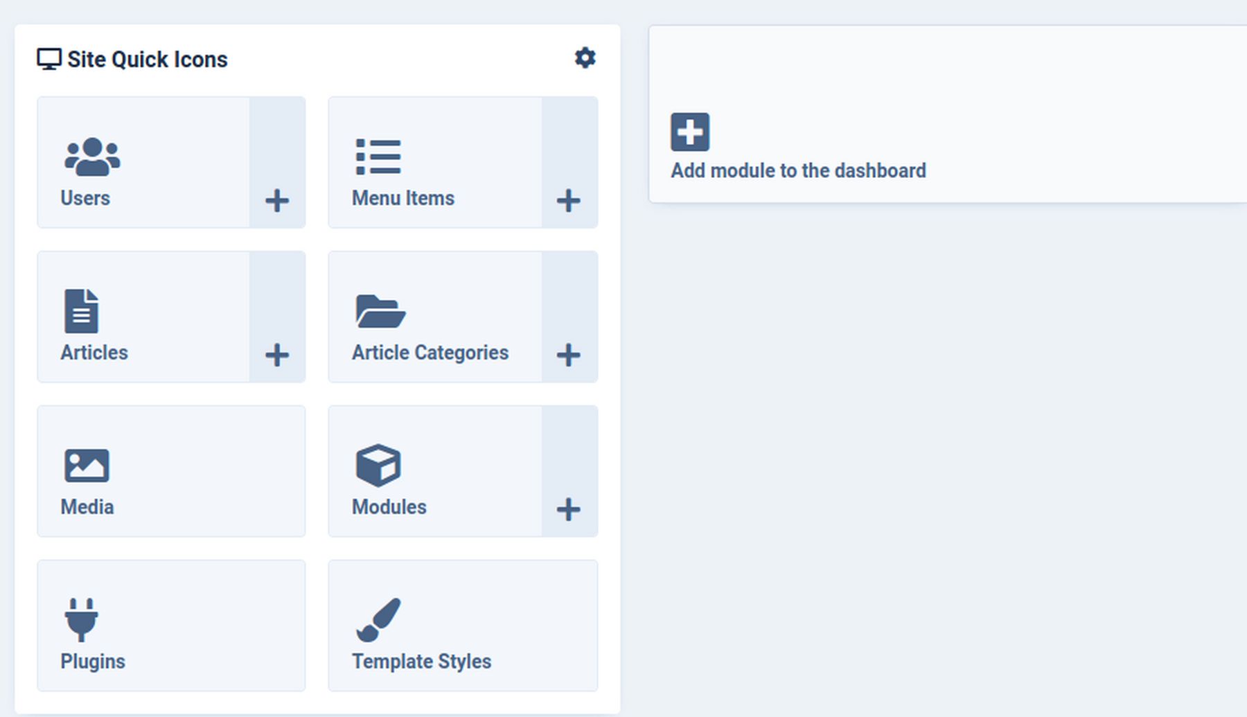
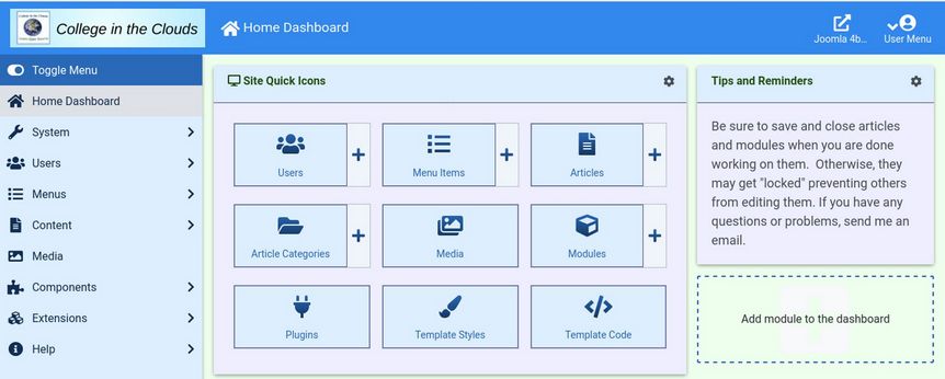
Now click on Add module to dashboard and select the Custom Module. For the title, type in Tips and Reminders. Type in advice for your clients or students: Be sure to save and close articles and modules when you are done working on them. Otherwise, they may get "locked" - preventing others from editing them. If you have any questions or problems, send me an email.
Then put the module in the cpanel position and click Save and Close:
Simplify the Top Bar
In the top bar, we really do not need 3 of the icon links. To unpublish these, click Modules, then change from Site to Administrator. Change the location from Cpanel to Status. Then check Joomla version, Multilanguage and Post Install Messages. Then click Actions, Unpublish. Then click Home Dashboard to go back to your Dashboard.
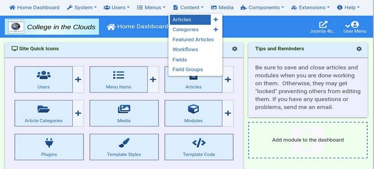
#2 Make the Joomla 4 menu structure similar to the Joomla 3 Admin menu structure.
By default, the new Joomla 4 Side Bar Main Menu has these 6 top level links:
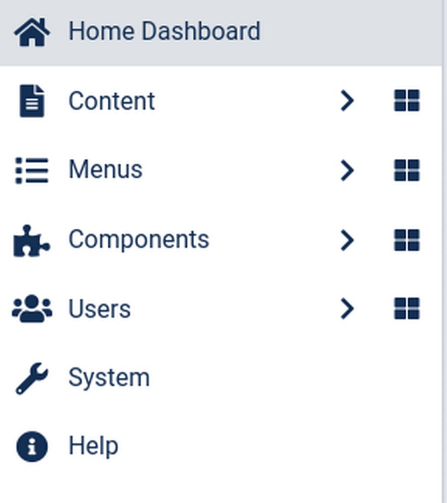
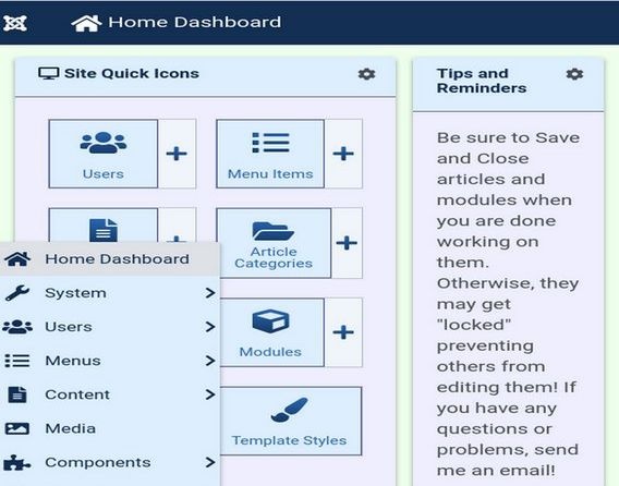
The biggest problem with this new menu is the 31 links hidden behind the System menu item. Thankfully, there is a very easy way to change the Joomla 4 main menu to look similar to the Joomla 3 main menu. Go to Modules, Administrator and click on the Admin Menu to open it.
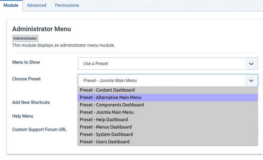
Use the drop down arrow to change the Preset from Joomla Main Menu to Alternative Main Menu. Then click Save and Close and go back to your Home Dashboard.
Here is the Alternative Menu in the Side Bar.
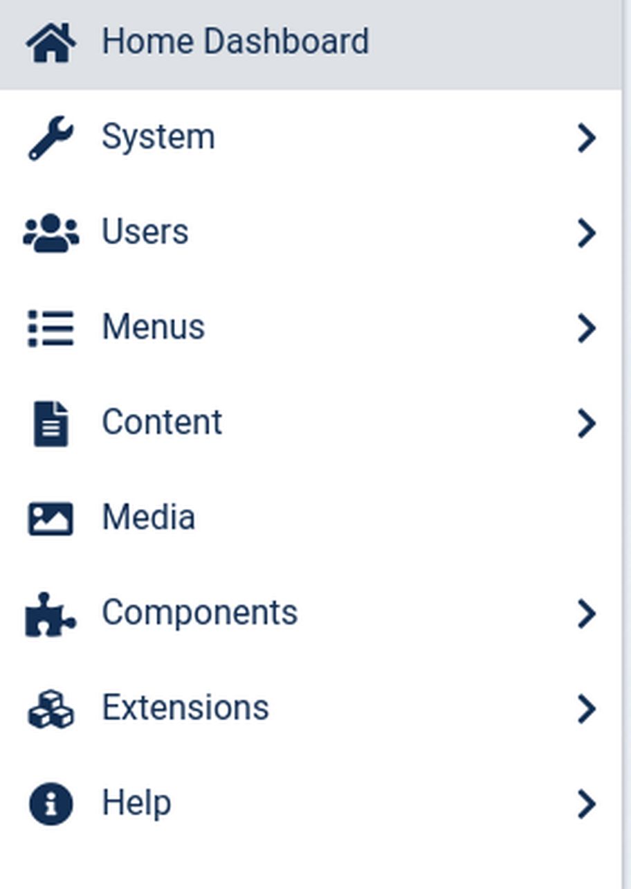
It is nearly identical to the Joomla 3 menu. There are 8 top level menu items. And no top level menu item has more than 11 second level menu items. That was easy!
#3 Make the Joomla 4 dashboard more colorful.
The Joomla 4 dashboard comes with a very easy way to change colors. Just click Template Styles. Change from Site to Administrator template. Then click on Atum to open it. Then click on the Color Settings tab:
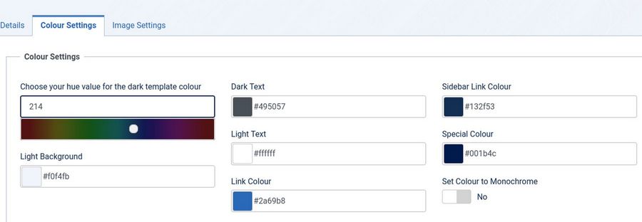
You like Green? Change the dark background color to 102 (it is not hexadecimal) and the light background to #eeffee (which is hexadecimal). Then change the Special Color to #339933. Then click Save and view the dashboard.
We can also change the logo to our own logo. We need to create and load 3 images to our Media Manager. Login Logo should be a 300 x 60 logo with icon and text, 100x100 brand-small and 180x100 brand large login icon. Then go to Template Styles, Administrator, Atum Edit, Image Setting tab:
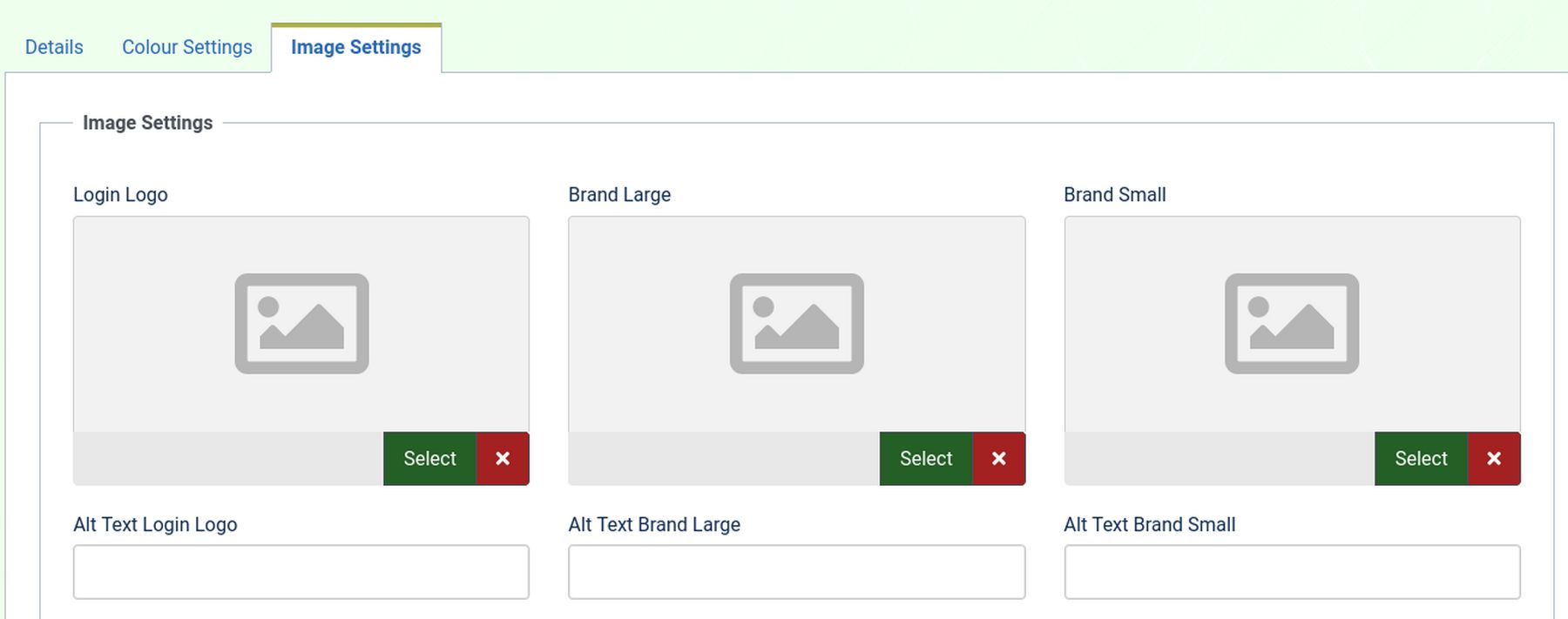
Add the images and the alt text. Then click Save and Close. Sadly, the Atum color picker will not allow me to change the top panel background color to a light blue color match by new logo:
Use CSS to change the color of anything you want
We will therefore create a user.css file in our Atum template CSS folder. Go to Template Code. Change from Site to Administrator. Then click on Atum to open it. Then click on New File.
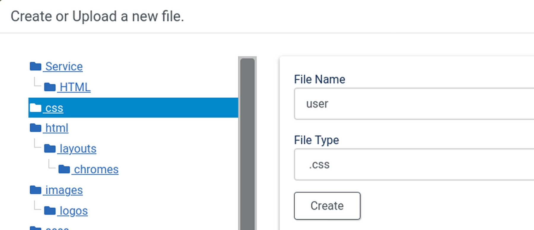
Type in user. Select .css for Type and click on CSS for location. Then click Create. Then add the following to your user.css file:
.header {background-color: #3388cc;}
Then click Save and Close. Then clear the Joomla cache and browser cache. Here is our new custom top bar:
Want even more colors? Add these to your user.css file to change the Control Panel background and the left sidebar background.
#wrapper {
background-color: #eeffee;}
.sidebar-wrapper {
background-color: #ddeeff;}
Add Color to the Site Quick Icons
Add these lines to your user.css file to improve the appearance of your Site Quick Icons:
.card-body {
background-color: #eeeeff;}
.com_cpanel .card-header {
background-color: #ddeeff;
border-bottom: 1px solid #555599; }
.quick-icons {
background-color: #eeeeff;}
.quick-icons .quickicon a {
background-color: #ddeeff;
border: 1px solid #555599;}
Then clear the Joomla and browser cache. Here is the result:
#4 CSS to make the Joomla 4 side menu and quick launch icons more compact
Here is some CSS to make the display more compact. The two boxes in the Joomla 4 control panel are both grid elements set for a width of 45% of the available space. With CSS Grid, we need to change the CSS on the Parent Element. Here is the default CSS:
.card-columns {
display: grid;
grid-template-columns: 1fr 1fr;
grid-gap: 0 15px;
column-count: 3;}
We will change this by adding the following to our user.css file:
.card-columns {
display: grid;
grid-template-columns: 2fr 1fr;
grid-gap: 0 15px;
column-count: 3;}
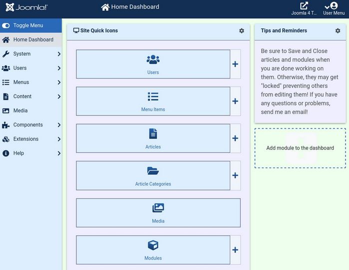
This will make the first column (the Site Quick Icons) twice as wide as the second column (Tips and Reminders). Then clear the cache. This gives our Quick Icons more room:
Make the Side Menu more compact
As you can see above, the side menu is way too wide. This is pretty easy to fix. Add the following 7 lines to our user.css.
.main-nav-container {max-width: 12rem;}
#sidebarmenu {max-width: 12rem;}
.sidebar-wrapper, .item-level-1 { max-width: 12rem; }
.sidebar-wrapper .sidebar-menu {flex: 1 0 12rem; flex-basis: 12rem;
max-width: 12rem;}
Then clear the cache. Here is the result.
CSS to allow for Side by Side Editing
One of the most important web building skills I teach my students is using Side by Side Editing. This process involves using a text and image editor like Libre Writer to create the content for your website. Then having a web browser open to your Joomla Dashboard next to the Libre Writer workspace to copy and paste content from your Writer document to your Joomla website dashboard. Here is what side by side editing looks like on a 15 inch laptop screen.
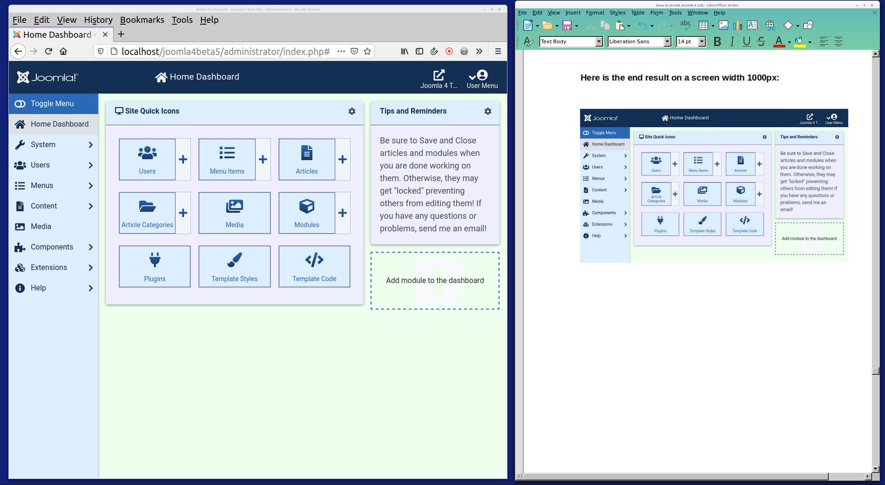
The problem is that with a laptop screen width of 1980 pixels, and subtracting 900 pixels for our Writer document, only 1080 pixels are left for our Joomla Dashboard. The problem is that Atum collapses the rows of Site Quick Icons too soon.
By default, at a browser screen width of 1360 pixels and above, the Atum Dashboard shows what it calls the XL layout with 3 Site Quick Icons per row. At a browser screen from 940 pixels to 1350 pixels, the Atum Dashboard uses a Large Layout and shows 2 Quick Icons per row.
At a browser screen width from 765 pixels to 930 pixels, the Atum Dashboard uses a Medium Layout which only shows 1 Site Quick Icon per row.
At browser screen widths from 575 to 760 pixels, the Atum Dashboard uses a Small Layout which (ironically) displays 3 Quick Icons per row again (but with the side menu now collapsed)!
At browser screen widths under 575 pixels, the Dashboard displays an XS layout with 2 quick icons per row and the Main Menu hidden in a circle in the lower right corner that pops up the menu when clicked.
In order to make it easier to do side by side editing, we want to display the Large 2 icon layout on Medium screen widths and the XL 3 icon layout on Large screen widths.
Moving the Main Side Menu left and the Custom Tips menu right will give us more room to display the Site Quick Icons as the browser screen width is made narrower.
Switching from Display CSS Grid to Display Flex
Quick Icons are all in a Display: Flex; group. This means the number of icons per row is controlled by the CSS for the Child item (rather than being controlled by the parent element as it the case with CSS Grid). There are two different kinds of Quick Icons (with or without the plus sign). The class for each child icon with a plus sign is .quick-icons .quickicon-group. The class for each child icon without a plus sign is .quick-icons .quickicon-single. As we may want to later display these two types of icons differently, we will have CSS Flex sections for each class. Here is the CSS we add to user.css for two icons per row above 700px and 3 icons per row when the browser screen is greater than 900px:
:root { --breakpoint-md: 576px;
--breakpoint-lg: 768px;
--breakpoint-xl: 992px;}
body { min-width: 768px !important; }
.container { min-width: 768px !important; }
@media (min-width: 576px) {.container, .container-sm .container-md {max-width: 540px; } }
@media (min-width: 768px) { .container, .container-sm, .container-md .container-lg { max-width: 720px; } }
@media (min-width: 992px) {.container, .container-sm, .container-md, .container-lg .container-xl {max-width: 960px; } }
@media (min-width: 1200px) {
.container, .container-sm, .container-md, .container-lg, .container-xl { max-width: 1140px; } }
Then clear the browser cache. Here is the end result on a screen width 1000px:
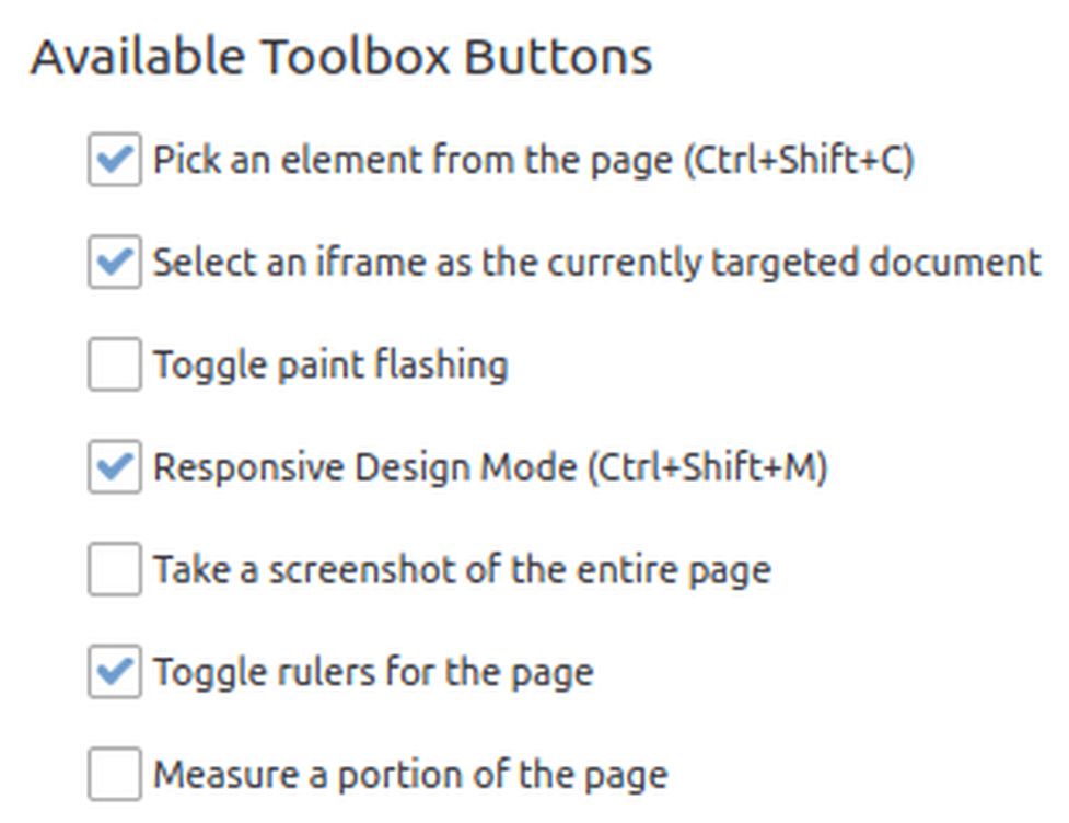
How to display screen widths with the Firefox Browser
For Firefox to show the screen width in pixels, display the Firefox Menu Bar. Then in this top menu, click on Tools, Web Developer, Inspector. Then go to the Customize, Settings page and check "Toggle rulers for the page" under Available Toolbox Buttons.
Then this icon appears in the upper right corner of the Inspector:
Click on the right angle icon to display the screen width in pixels (you can then adjust the screen width while still having the inspector open and watch when the display changes).
#5 How to replace the Joomla 4 Side Menu with the Joomla 3 Horizontal Top Menu
Several people on the Joomla 4 forum preferred the Joomla 3 horizontal Main top menu over the Joomla 4 vertical side Main menu. If you are one of them, there is good news. There is now an extension on the Joomla Extensions Directory that turns the main menu back into a horizontal top menu. Here is a link to this extension: https://extensions.joomla.org/extension/phoca-top-menu/
Install the extension. Then go to the Module Manager and change the display from Site to Administrator. Then publish the Phoca Top Menu Module in the Custom Top position using the Alternative Main Menu.
Then unpublish the Admin Main Menu that is in the Sidebar.
Hide the sidebar
Line 23: change these values from 12 rem to 0 rem.
.main-nav-container {max-width: 0rem;}
#sidebarmenu {max-width: 0rem;}
.sidebar-wrapper, .item-level-1 { max-width: 0rem; }
.sidebar-wrapper .sidebar-menu {
flex: 1 0 0rem;
flex-basis: 0rem;
max-width: 0rem;}
and add these lines:
.navbar-toggler { line-height: 0;}
.navbar-toggler-icon {width: 0em;}
.sidebar-wrapper .item > a {height: 0px;}
.sidebar-wrapper .item-level-1 > a {font-size: 0rem;}
Then clear the cache. Here is what this Top Menu extension looks like in the Joomla 4 Dashboard:
Getting rid of the Side Menu and replacing it with a top menu really makes it easier to narrow the screen to do Side by Side Editing.
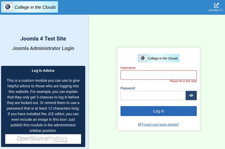
Bonus: Customize the Joomla 4 Administrator Login Page
The Joomla 4 Administrator login page comes with a module with links in the lower left corner. You now have the option to replace this Login Information module with your own custom module. Just go to Modules, Administrator. Find the Login Support module and unpublish it. Then click New and choose a Custom Module. Change the module name to Log In Advice. Then add whatever text you want. If you have installed the JCE Editor, you can even add images to your Log In Advice module.
This is a custom module you can use to give helpful advice to those who are logging into this website. For example, you can explain that they only get three chances to log in before they are locked out. Or remind them to use a password with at least 12 characters. If you have installed the JCE editor, you can even include an image in this box! Just publish this module in the administrator sidebar position.
Here is what the Joomla 4 Administrator Log in screen looks like after all of these changes.
An Offer You Can’t Refuse… Get my user.css file for FREE!
OK. So if you know a little CSS, you can convert your dull complex Atum Dashboard into a simple colorful Joomla 3 Dashboard in less time than it takes to read this article. But what if you do not know CSS and you do not want to learn CSS? Well… have I got a deal for you. Once Joomla 4 Stable is finally released (sometime in 2021), I will post a user.css file with all of these changes in a link on our College in the Clouds website. You can then use this CSS file to copy paste into your own user.css file. In less than one minute, you will have the Joomla Dashboard you have always wanted – for absolutely free!
The new Joomla 4 front end template, Cassiopeia, is fantastic – and way better than the Joomla 3 Protostar template. Just look at all of these module positions:
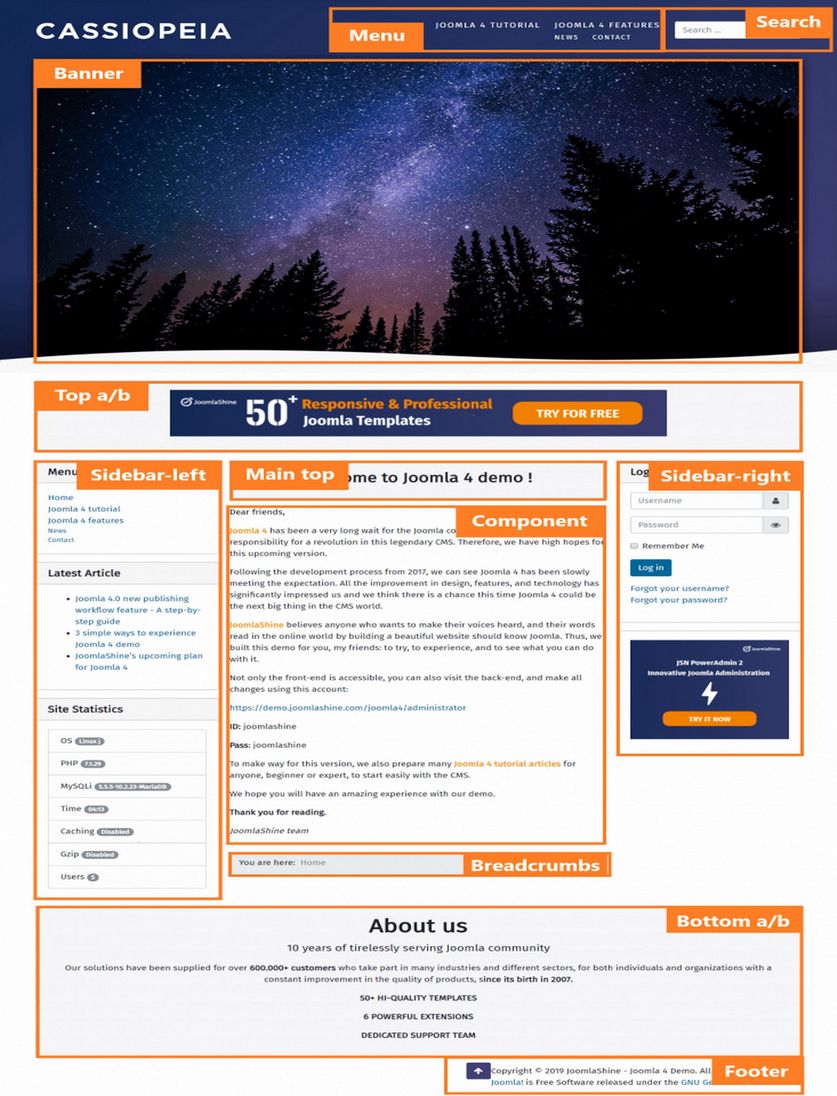
And with Joomla 4 support for CSS Grid, you no longer even need most of these module positions.
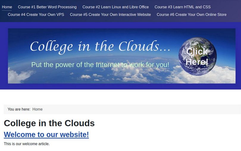
View the Header
Insert a custom header module (image width 2000) to replace the Cassiopeia Logo. Place the header in the Banner position. Then turn off the Cassiopeia template branding section.
View the Horizontal Menu
We will create some menu items using external URL links to College in the Clouds courses to see what the main menu looks like in the horizontal orientation. Select the Main Menu module and change the position from sidebar-right to menu. Hide the title. Then click Advanced and change the layout to collapsible default menu.
What’s Next?
This completes our VPS course. In our next course, we will review how to set up and use the Joomla 4 Content Management System. Here is the direct link to our next course:
https://createyourowninteractivewebsite.com/